|
|
How could we better serve the homeless in our area? What if we could make it easier for those who are housing and food insecure to get the help they need?
|
|
Project Type:
Interactive Kiosk |
Time Span:
October - December 2019 |
Role:
Interaction & Visual Designer |
About Horizon
How could homeless shelters be improved? How could the stress of mountains of paperwork be reduced so that case managers and volunteers alike can dedicate more time to helping the truly needy? These questions would end up serving as the basis of this endeavor.
Horizon is a kiosk based application that allows homeless users to "check in" to shelters, request services, or find other nearby shelters that may have the key services that they need. Some of the services the users could access include showers, laundry, meals, and counseling services.
Horizon is a kiosk based application that allows homeless users to "check in" to shelters, request services, or find other nearby shelters that may have the key services that they need. Some of the services the users could access include showers, laundry, meals, and counseling services.
The Team
- Seb Gonzalez - Design and Research
- Connor Friden - Design and Research
- Muhammad Bilal - Scrum Master
This project required us to utilize Lean UX; a combination of Lean Startup practices and Agile Development. At the core of Lean UX are small, cross functional and co-located teams that develop a minimum viable product as quickly as possible. By working in two Three-Week Design Sprints, our team was able to define a problem statement, develop a hypothesis, create a product backlog, and eventually deliver a strong-designed product.
We were constantly challenged by creating assumptions about our product and its users, and setting out to prove/disprove these assumptions and update our objectives and backlogs accordingly. The caveat of Lean UX is that it requires a multi-disciplined team, and since the three of us all share similar skill sets, this couldn't really qualify as "true" Lean UX. But the experience was invaluable and helped mold us into more efficient designers.
Sprint 1: The Beginnings of Horizon
After our initial meetings, we all agreed to work on a kiosk that would be meaningful and uniquely challenging. Homelessness is a pervasive issue across the United States, especially in large metropolitan areas. We began with the idea of how we can better serve the homeless population. Thus begins our Week Zero.
|
Product Problem Statement
As a group, we collaborated on a Problem Statement. In this form, we answered several questions about our product, such as:
Assumption Worksheets and Affinity Mapping We started this process individually. What were some assumptions we had about our users? How would they use the kiosk? What kind of business outcomes did we have? After the three of us filled out our assumption worksheets, we met in person to affinity map our findings. From there, we were able to create a product backlog. |
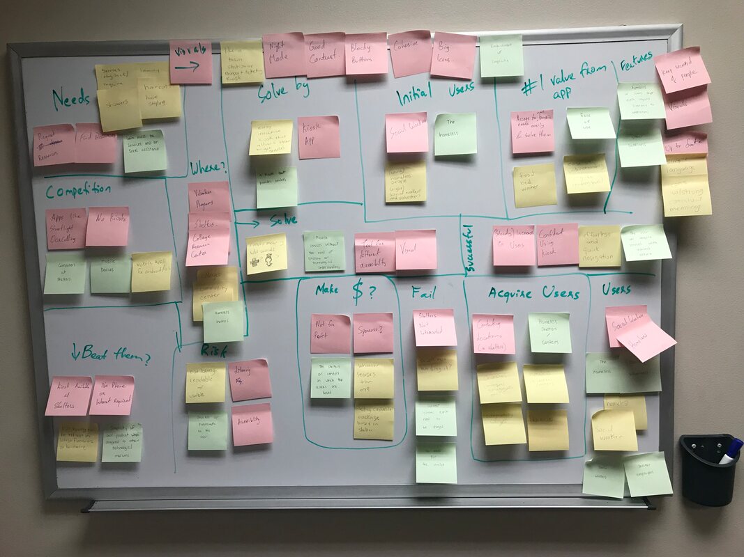
The culmination of our assumptions, in affinity map format!
|
Product Backlogs and Proto-Personas
We built a product backlog as a result of our collaborative affinity mapping that enabled us to highlight the features we wanted to work on and what business outcomes they would fulfill. Due to the time sensitivity of Lean UX, we quickly had to determine which features we were going to prioritize, and which ones were the most feasible to accomplish. Our initial product backlog table can be accessed at this link.
We built a product backlog as a result of our collaborative affinity mapping that enabled us to highlight the features we wanted to work on and what business outcomes they would fulfill. Due to the time sensitivity of Lean UX, we quickly had to determine which features we were going to prioritize, and which ones were the most feasible to accomplish. Our initial product backlog table can be accessed at this link.
|
|
We also needed to create proto-personas to better understand who we're designing for, and as a means to validate our hypotheses.
|
Prototyping:
Week One was now officially underway. After getting the assumptions and hypotheses out of the way, our next objective was to create prototypes. We had our assumptions and backlogs handy, so we needed to get the minimum viable product ready for our user testing the following week.
Week One was now officially underway. After getting the assumptions and hypotheses out of the way, our next objective was to create prototypes. We had our assumptions and backlogs handy, so we needed to get the minimum viable product ready for our user testing the following week.
|
|
We began paper prototyping. The three of us created this paper prototype during one of our meetings. This paper prototype would soon serve as the basis for our higher fidelity prototypes, as well as serve as a good vehicle for user testing in the following week.
Some of the challenges we faced included:
|
|
From there, we moved onto Figma as our prototyping software of choice. We designed a wireframe that we all worked on together to get an easy-to-modify idea of how our higher fidelity prototype would pan out.
|
|
Below is a screenshot of what the Medium Fidelity Prototype looked like for the interview we had scheduled.

Interviews:
Week Two would be when we would get our interviews scheduled. One of our painful points was us having a good lead for someone who worked exclusively with homeless clients and had success with improving their lives, but her schedule wouldn't allow her to meet with us. Our next best bet was to meet with the CARE Center at Kennesaw State University.
Campus Awareness, Resource & Empowerment, otherwise known as CARE, has an office located on both campuses. The staff assists students who are food and housing insecure, and we had hoped they could provide us good insight on homeless populations and a better look at their actual needs and wants.
Unfortunately, I was not able to make this meeting, but Connor and Muhammad recorded an audio transcript and took notes on the interview. Our kiosk idea was met with positive comments. The notion of a kiosk being available (especially after hours) to find shelters open with available beds and meals netted us a positive response.
Sprint 2: A Shift in Assumptions
We were given a week break to decompress and we were still waiting to hear back from some of the shelters and personnel we reached out to. Once we were ready to start the next sprint, we decided to look back at our hypothesis table and revise any assumptions we had made. Week Zero's goals were already set by Muhammad. He wanted us to prepare scripts to call out to shelters and schedule interviews.
In the meantime, we went back to paper prototyping. One possible issue we were looking at was literacy. How would the homeless person be able to check in if they couldn't read or write? We had came up with a solution to create an interface that only the case managers and volunteers. I started to make a paper prototype for said interface. Eventually, a medium fidelity prototype was created.
In the meantime, we went back to paper prototyping. One possible issue we were looking at was literacy. How would the homeless person be able to check in if they couldn't read or write? We had came up with a solution to create an interface that only the case managers and volunteers. I started to make a paper prototype for said interface. Eventually, a medium fidelity prototype was created.
|
Week One was exciting, as we finally secured an interview with Must Ministries. The interview with Must was one of the most insightful ones. We spoke with a case manager and discussed her experiences with working with homeless people, showed her the medium fidelity prototype, and got really insightful feedback from her. Some of the great takeaways we got were:
We also asked the case manager if this would be a kiosk app she would be interested in, if money wasn't an issue. She enthusiastically said that she would appreciate something like this, especially if it helps mitigate the huge stacks of paper that the shelter's intake forms require. Ultimately, we had to shift our hypothesis table and product backlog with this new notion of information. |
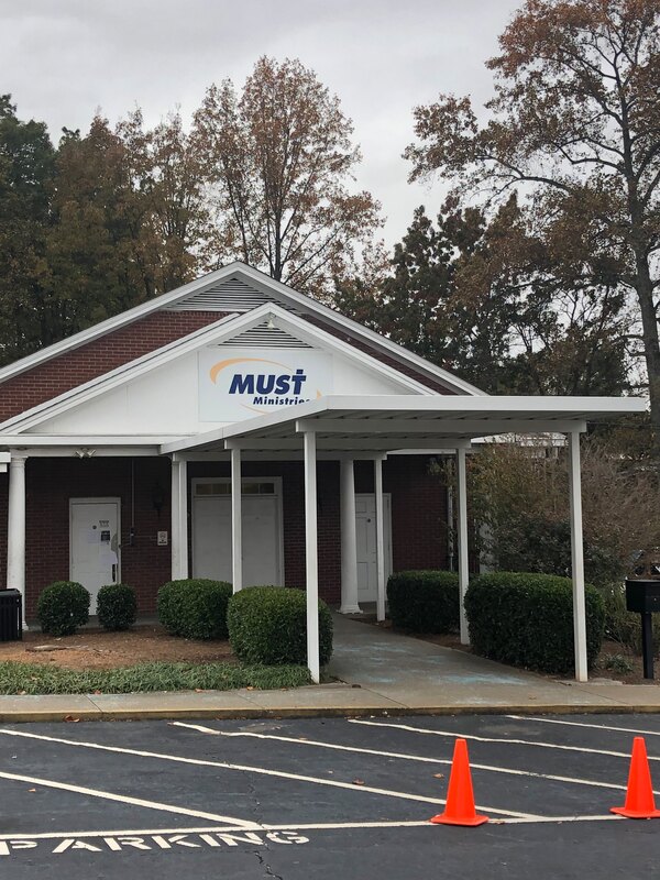
Must Ministries is a public, non-profit shelter that gets its funding from the Department of Housing and Urban Development. Must has 4 locations in Cobb County, Georgia
|
|
Week Two, our final sprint week, was what truly challenged our assumptions. Our meeting with Must Ministries gave us the feedback needed to start working on a higher fidelity prototype. Thankfully, we had another interview with the CARE Center scheduled. We made sure to polish our prototype to present to the director of the CARE Center on the Kennesaw campus.
On the side, you can see a slideshow of what we had planned for a sign-up form. Unfortunately, this would later be discarded due to time constraints. |
|
The interview with the CARE Center on Kennesaw campus was intense. The director was very busy, especially with coordinating her staff members to do inventory counts on food in their pantry. There were times where she had to excuse herself from the interview, but we still were able to hold a lengthy interview with a lot of interesting facts and truths. I'd even go as far as to say we should probably have spoken with her sooner.
One of the biggest points she made was the nature of how limited the funding the CARE center got, as well as other non-profit organizations. Unfortunately for us, the reality of the limited funding would make the business goal of leasing the kiosk to homeless shelters unfeasible. However, the director did suggest it was possible to have the kiosks sponsored by businesses, and in exchange, the kiosk would have some sort of branding relating to the benefactor.
Another interesting criticism we had gotten was the nature of privacy and anonymity. Homeless people are already at a high risk, that there would need to be higher degrees of care when it came to the intake paperwork for the shelter. Some homeless people may not feel comfortable giving out their name or giving out medical history. At that point, the check-in paperwork interface would have to take a back seat for the sake of completing the main goal of the kiosk.
The CARE center director had a somewhat positive opinion of our kiosk, but she argued that "laundry" wasn't as important as "medical". This was an interesting take, and I ascertained that the check-in experience wasn't universal. Another critique she had was about our map feature; she would have liked to see transportation features added, such as directions, the ability to hail a ride share, or check public transit schedules. By the end of this interview, we felt like we were even further from our goal than we had anticipated. It was pretty overwhelming. However, this was not the time to lose heart. We still ended up persevering.
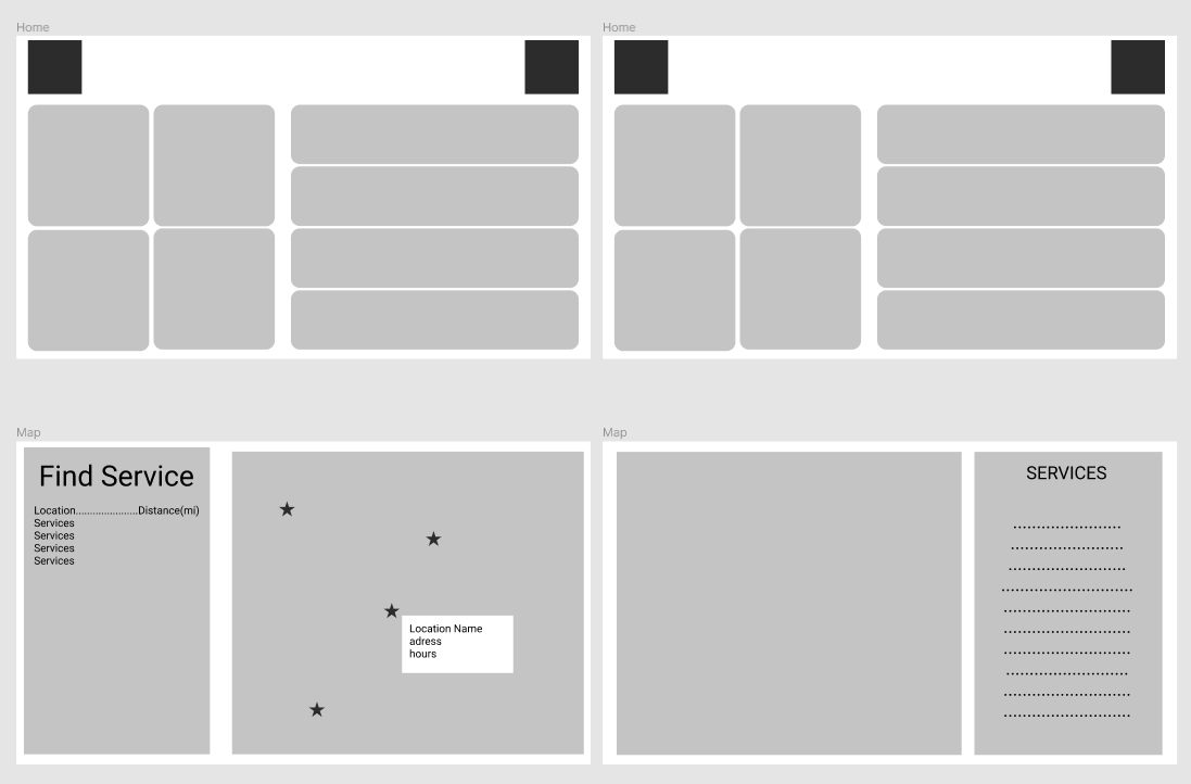
The Final Product
With the pressure on to deliver a final project, we were able to finish the prototype seen below. The screenshots below are a selection from the massive prototype we made. If you'd like to interact with the prototype and truly see the scope of this project, you may do so by clicking here.
Closing Thoughts
Some of the specific things I did included:
I legitimately enjoyed working on this project, and found Lean UX to be a highly rewarding process. Of course, I also attribute the success to my teammates' hard work and excellent communication and feedback. The scope of this project as well as the potential impact this could make on the community really made the experience worthwhile.
Thank you so much for taking the time to experience the journey and progress of this kiosk app. I can easily be reached via email or LinkedIn mail if you have further questions.
- Creating the wireframe of the Kiosk's UI
- Designing the product icon/logo in Adobe Illustrator
- Drafting the paper prototype for the intake UI
I legitimately enjoyed working on this project, and found Lean UX to be a highly rewarding process. Of course, I also attribute the success to my teammates' hard work and excellent communication and feedback. The scope of this project as well as the potential impact this could make on the community really made the experience worthwhile.
Thank you so much for taking the time to experience the journey and progress of this kiosk app. I can easily be reached via email or LinkedIn mail if you have further questions.