|
Project Type:
Mobile Application |
Time Span:
February - April 2020 |
Role:
Team Lead / Interaction Designer |
Overview
|
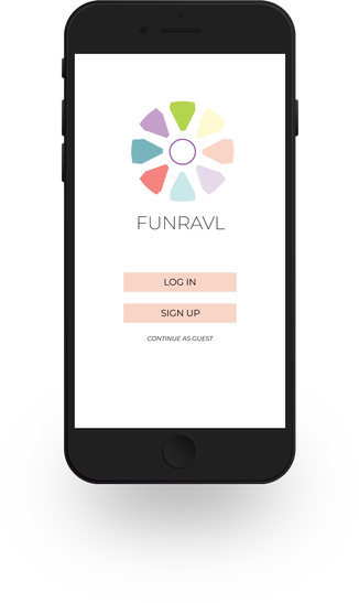
Going on vacation has continued to get more and more expensive, and we're often too busy (or strapped for cash) to get out of the house and have an adventure. But what if your next vacation was right around the corner and affordable? By using Goal-Directed Design, my teammates and I wanted to bring that possibility to the users.
Welcome to Funravl. |
|
The Team!
I had the privilege of working (and leading) a group of passionate interaction designers who were great at what they did, responded well to criticism and gave helpful feedback. We all took on multiple roles in the project, combining our strengths and skills into this endeavor. But to be more specific:
- Lina Davis: Visual Designer
- Seb Gonzalez: Team Lead
- Madison Horton: Visual Designer
- Henry Pham: UX Designer
What is Goal-Directed Design?
It's a design framework developed by Alan Cooper and it is used in product development to address the most important part: users and their goals! By following an iterative design process, design teams can collaborate to deliver a viable product that addresses the user's needs, wants, frustrations, and goals.
Research
We needed to do some prior research to create this prototype. One of the first things we did was a competitive audit and literature review. Since the purpose of this app was the be an aid in vacation planning, we looked at other apps in the Google Play and App Store to see what kind of features they offered and what kind of features they didn't, and how we could play that to our strength.
The official apps for theme parks such as Walt Disney World or Six Flags were already pretty comprehensive. Additionally, there were plenty of other unofficial, fan-made apps for the larger parks. We did not want to re-invent the wheel or try to compete with what these apps did well, and instead wanted to see what they didn't do. There was no need for us to design a companion app to an established park that already had a dedicated team of developers.
The official apps for theme parks such as Walt Disney World or Six Flags were already pretty comprehensive. Additionally, there were plenty of other unofficial, fan-made apps for the larger parks. We did not want to re-invent the wheel or try to compete with what these apps did well, and instead wanted to see what they didn't do. There was no need for us to design a companion app to an established park that already had a dedicated team of developers.
|
We interviewed six people to gauge their attitudes towards theme parks, attractions and vacationing as a whole. Our questions were qualitative, asking the interview subjects questions about their best and worst theme park experiences, if they participated in other activities while on vacation, and when they liked to go on vacation. From there, we were able to accumulate some interesting findings.
It was no surprise that time and money were the biggest factor in deciding when and where to go on vacation. |
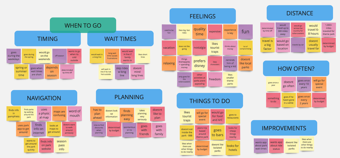
an affinity map, derived from user answers. click to enlarge!
|
Modeling
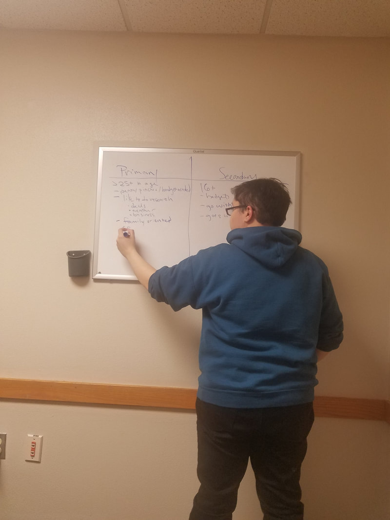
Through summarizing our interviews and research we were able to triangulate the common desires, and goals of our interview subjects. From there, we were able to create models of the ideal user of our app, commonly known as a user persona. We made the decision to create multiple personas, in order to be able to design around the goals, frustrations and needs of the target users of our app.
Our primary persona, we decided, was a mother who was very frugal and wanted to make the most of her limited time off and tight budget. Our secondary persona was a laid back young adult who didn't really care for planning, but liked to see what his options were whenever he was out of town with his friends. Despite having two different attitudes about vacations, we felt that we could create an application that both personas could find use in.
Our primary persona, we decided, was a mother who was very frugal and wanted to make the most of her limited time off and tight budget. Our secondary persona was a laid back young adult who didn't really care for planning, but liked to see what his options were whenever he was out of town with his friends. Despite having two different attitudes about vacations, we felt that we could create an application that both personas could find use in.
Requirements
|
We made good progress in getting our research together and creating our personas, so our next task was to address the features our users would need in order to successfully use Funravl.
Some of the features we deemed necessary included:
|
|
Framework
|
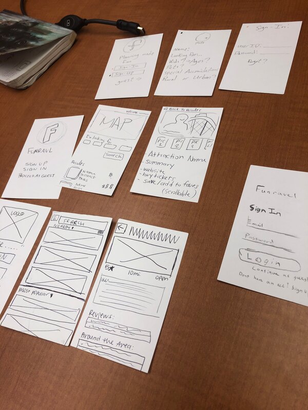
In order to accurately map out how our app would work, we needed to start the process by creating prototypes. We started off working on sheets of index-card paper to get a brief idea of the flow the app would work. The goal in prototype creation is to create a representation of your product, but in a quick way that's easy to edit and build on top of.
Low fidelity prototypes are typically made from paper and allow the design team to rapidly implement changes on the fly. The four of us got together and created our own version of the app's home screen and overview. From there, we moved into Figma to create a uniform wireframe that we collaborated on together (as opposed to individually). We wanted to progress further into a medium fidelity prototype before we felt comfortable in conducting user testing. |
Below is a slideshow showing progress from black and white to our preliminary color mock up.
User Testing and Results
We presented the users we tested with questions broken into three separate categories.
On the other hand, some of the more design-tuned users we tested suggested we improve our use of color (namely, not using bright, saturated colors as much) and to be mindful of the amount of text on the screen. Our users did not want to read an encyclopedia article to learn more about a theme park, as it added an unnecessary amount of cognitive load. Having a map feature on the main screen did not test well either and there were several requests for a search feature.
- General questions about the app and impressions of it.
- Task related questions.
- Post-test related questions and feedback.
On the other hand, some of the more design-tuned users we tested suggested we improve our use of color (namely, not using bright, saturated colors as much) and to be mindful of the amount of text on the screen. Our users did not want to read an encyclopedia article to learn more about a theme park, as it added an unnecessary amount of cognitive load. Having a map feature on the main screen did not test well either and there were several requests for a search feature.
Refinement
The feedback we got was very constructive, and while we succeeded in providing a usable prototype that our test subjects could navigate with ease, we needed to address the color issues. Our initial idea was to use bright, saturated colors because we felt it would incite fun, exciting feelings.
Since this design choice didn't test well, we went ahead and tried using bright colors, but more so on the pastel side. This still invoked friendly (as opposed to exciting) and fun, but wasn't overwhelming to look at. The newer colors tested much better with the users.
Since this design choice didn't test well, we went ahead and tried using bright colors, but more so on the pastel side. This still invoked friendly (as opposed to exciting) and fun, but wasn't overwhelming to look at. The newer colors tested much better with the users.
|
|
Support
|
The COVID-19 outbreak was the largest obstacle in the progression of the project. Social distancing measures made it impossible to meet in person and the awkward schedules we had as a team resulted in slower communication (even when we used messenger apps like Discord and GroupMe!).
However, we remained resilient and adapted to the challenges presented by us and were able to introduce the much needed features we had missed in previous iterations of the prototype.
|
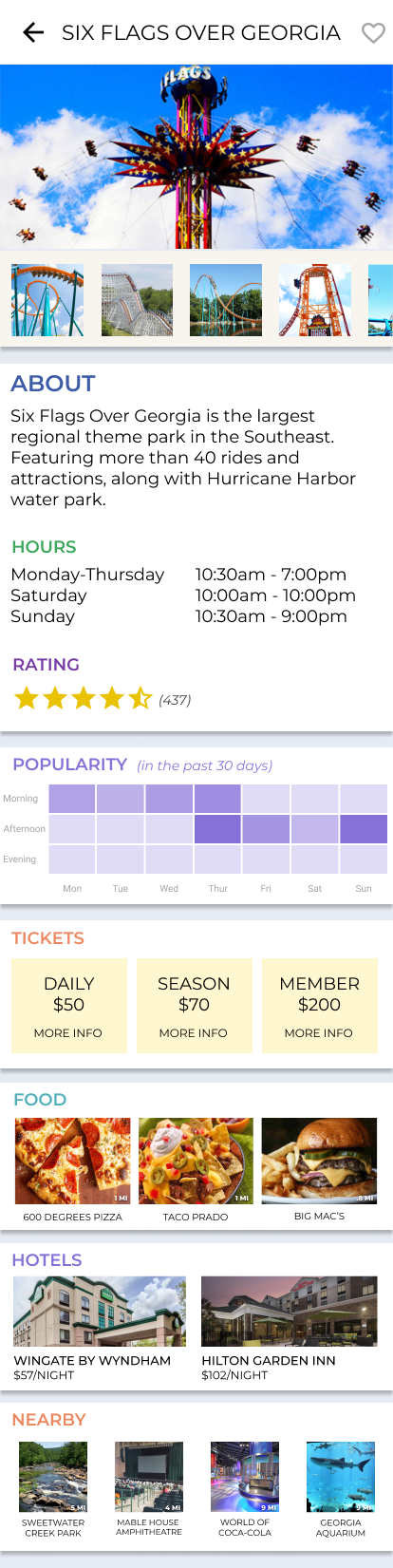
The improved Six Flags attraction page!
(click on the thumbnail to enlarge it) |
Closing Thoughts
All things considered, this was a fantastic revisit into the Goal-Directed Design process. Since this project was for my Senior Project & Portfolio class, I felt prepared to apply the culmination of my learning as an interaction designer into something so meaningful and enjoyable.
A lot of this would not be possible without Lina, Madison or Henry's hard efforts and near-literal burning of the midnight oil. I am also grateful to the guidance and feedback of fellow students and the staff at the Department of Technical Communication and Interactive Design at Kennesaw State University.
The deliverable prototype can be accessed at this link.